True&Co. – Narrowing the Results
THE PROBLEM
The original design for the filters was difficult to use with so much horizontal scrolling within a small space. Once we created a prototype, we realized that it was too easy to accidentally scroll the wrong filter. The original concept also included a visual sentence that builds as the user makes selections which was missed due to the location at the bottom of the filters. Users could not easily see if their filters were applied.

TEAM & ROLE
I led a team of 3 designers and collaborated with our brand partner to achieve a solution that was both usable and maintained the brand aesthetic. I coordinated user testing to test multiple filter interactions to see which our customers found most usable. I also worked closely with our front end and backend teams to ensure that the final solution was manageable and accurately reflected current inventory.
THE PROCESS
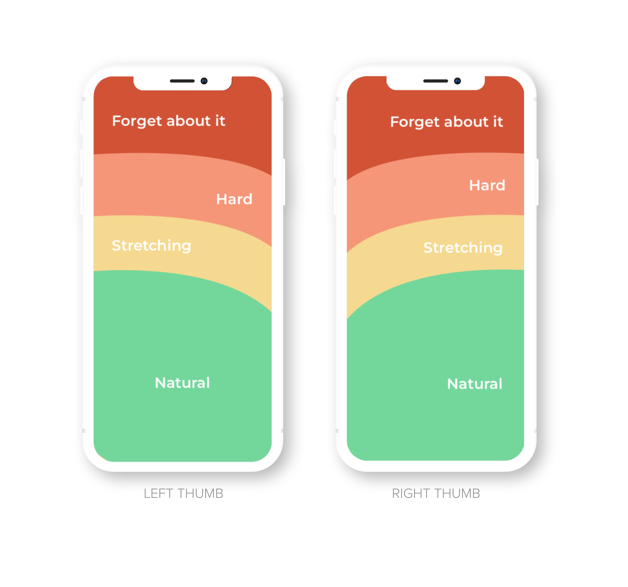
We started to look at user thumb zones. 75% of users touch the screen with only one thumb (See article How Do Users Really Hold Mobile Devices?) When phones were small, most areas were easy to reach. As screens got bigger, the top part became almost impossible to touch (See article Bottom Navigation Pattern On Mobile Web Pages) In the existing design, users would only be able to reach the lower filters and if they’d need both hands to reach the higher ones. We then explored different designs based on these natural thumb zones. We also knew that a majority of our customers were using larger devices so this was extremely important to get right.
Filter interaction concepts from left to right below:
Rolodex: This interaction flipped through the options like a rolodex and focused the user on 1 filter at a time
Dial: We explored a circular dial interaction where users could spin to make selections
Tabs: We limited the filters to 2 horizontal scrolling areas and users could tab through the different options and make selections within

RESULTS
We tested the different interactions based on thumb zone patterns and the Tab experience was the clear winner. Our final design focused the horizontal scrolling within the ‘Natural’ thumb zone so that users could make multiple selections with one thumb. We maintained the sentence, but moved this to the top into the difficult to reach thumb zone areas because users would not need to interact with this element.
